c o l o r
I love color and form so it makes sense that I would be drawn to
the realm of gemstones, which span the color wheel and offer endless opportunities for
different combinations.

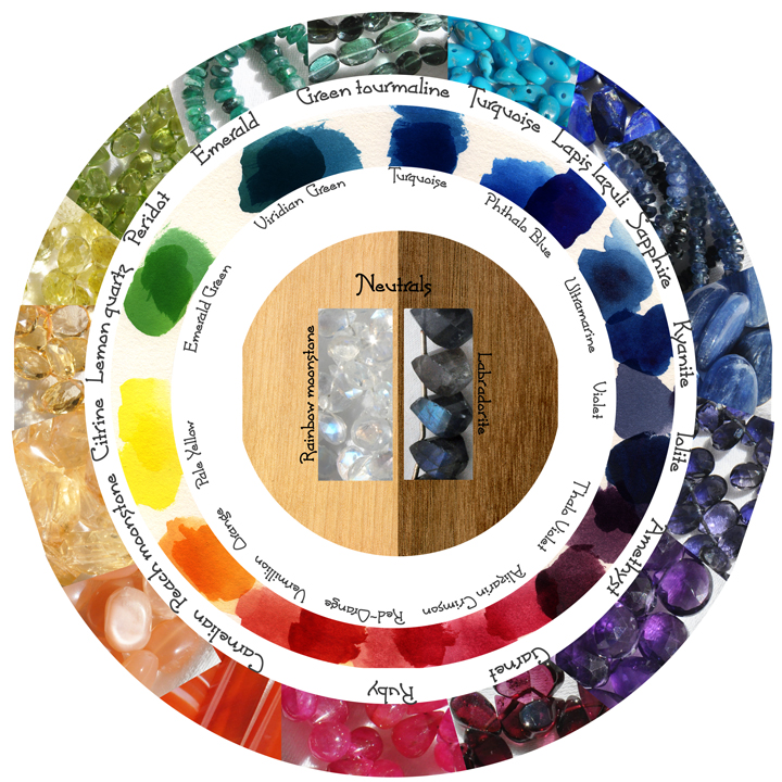
This is a classic watercolor inspired color wheel, whose primary colors are
cadmium pale yellow, phthalo blue and alizarin crimson. These are used to create secondary and tertiary
colors. The links below group jewelry items by the color in the piece.
f u n f a c t s :
Color differences in minerals typically result from a
small change in chemical composition. For example: amethyst and citrine are the same chemical
structure (quartz - SiO2) with differences in trace amounts of iron. Amethyst and citrine can
form in the same crystal, a gemstone called "ametrine" with a striking complementary
color contrast.
Many gemstones are heated or irradiated to enhance color properties; these are
common and generally permanent treatments, unlike dyeing or coating a stone which can show wear with time
and exposure to sunlight. As a general guideline: if the color looks too bright to be
natural, it's probably not! I make a note of any treatments that I know of applied to materials.
In earlier days, I was drawn to dyed chalcedony stones because of their vibrant colors, only to
be disappointed as this color faded - especially with exposure to sunlight - and I was left with a
bunch of dirty-hued rocks. Now, I tend to avoid dyed stones and I cast a wary eye on dyed pearls,
though they tend to fare better with time and wear.
I'm a physicist so I relate to color in terms of its place in the electromagnetic spectrum
in addition to finding colors aesthetically pleasing. References from color theory and physics
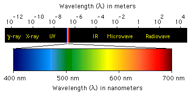
textbooks coexist peacefully in my color pages. The graphic below is a standard image depicting
visible light (what we can see) relative to the electromagnetic specturm.
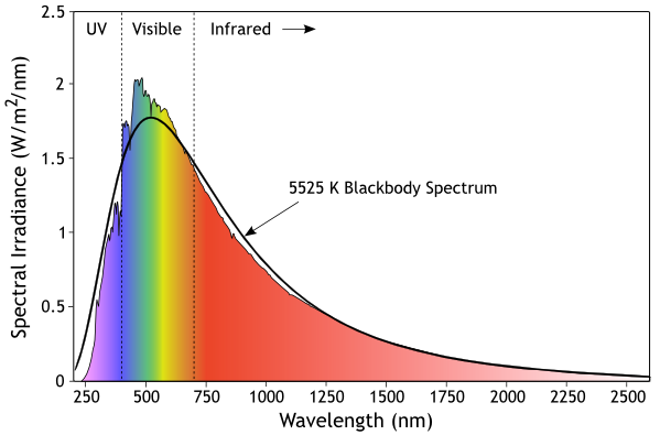
In natural daylight, what we see is reflected light from the sun, and the sun emits different
intensity of light at different wavelengths; this is the solar spectrum. When a lightbulb claims
to be like natural light, it means the spectrum of its emitted light is similar to the solar
spectrum. The peak of the solar spectrum can be estimated by Wien's law, which is a formula
that relates a source's surface temperature to the wavelength at which more power is emitted than at
any other wavelength. The sun's surface temperature is around 5500K, which leads to a peak wavelength
around 500nm, which is near the center of what we call visible light. Very cool.
•••

 This is a classic watercolor inspired color wheel, whose primary colors are
cadmium pale yellow, phthalo blue and alizarin crimson. These are used to create secondary and tertiary
colors. The links below group jewelry items by the color in the piece.
 In natural daylight, what we see is reflected light from the sun, and the sun emits different
intensity of light at different wavelengths; this is the solar spectrum. When a lightbulb claims
to be like natural light, it means the spectrum of its emitted light is similar to the solar
spectrum. The peak of the solar spectrum can be estimated by Wien's law, which is a formula
that relates a source's surface temperature to the wavelength at which more power is emitted than at
any other wavelength. The sun's surface temperature is around 5500K, which leads to a peak wavelength
around 500nm, which is near the center of what we call visible light. Very cool.
